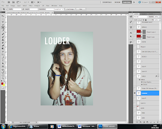
I opened the image in photoshop to start editing it for my magazine. I edited the image by changing the levels by making the image darker to make it more dominent on the page.
Here I selected the text tool and tpyed in the name of my magazine 'LOUDER'. I highlighted it and chenged the colour of the writing to white to make sure I followed the colour scheem that I wanted.
Here, I used the Poloygon Lasso tool to make the square to go around the masthead text. I selected the paint brush tool and i colour it in red, to also follow the colour scheme.
Here, I slected the text tool and typed in the text 'ADELE', I then rotated is to go across the page like a conventional magazine would, I then added a drop shadow and a sroke to make the text look better, and stand out as though it was 3d.
This is the box that came up when i selected the drop shadow, I changed the options to make it how I wanted it to look.
Here, I added the text 'SECRETS REVEALED' under the 'ADELE' text, this would make the audience mroe interested. I did this by selecting the text tool and typing in the text, I then added a stroke to give the text a white outline to make it look better and follow the colour scheme.
Here, I added the text at the top of the front cover. I did this by selecting the etxt tool and typing in teh text 'THE WORLD BEST MUSIC MAGAZINE', this would make the magazine sell better.
Here, I added the red band at the bottom of the page, I did this by selecting the shape tool and drawing a rectangle, I then re-sized it and placed it to the bottom of the page.
Here, I created the shapes that I would put the text in for the left third. I did this by selecting the Poloygon Lasso tool and drawing the shape, I then selecting the paint brush tool and coloured the shape in, with white to follow my colour scheme. I also made the rectangle in the same way in the top right hand corner.
Here, I inserted the text the the left third. I did this by selecting the text tool and typing in the text that i wanted. I highlighted the text to changed the colour of the text to follow the colour scheme.
Here, I inserted the smaller text to go with the stories on the side, I did this by selecting the text tool an dtyping in the text I wanted. I highlighted it and changed the colour of the text to follow my colour scheme.
Here, I put the text in the red band at the bottom of the front cover, I did this by selecting the text tool and typing in the text that I wanted, i highlighted the text and recoloured the text to make sure it followed the colour scheme that I wanted.
Here, I inserted another picture to the top right hand of the front cover. I did this by opening it in another photoshop programme and then slected the full images and then copied and pasted it onto the front cover. I also edited the image by adding a stroke to make a white border around the edge of the image, to make it better and follow the colour scheme.
This is the box that came up when I selected the stroke option, I changed the options and settings to make the image look good.
Here, I added the text 'FREE' to the right hand corner for the poster. I did this by selecting the text tool and then typing in the text that I wanted.


No comments:
Post a Comment