Friday, 30 March 2012

Evaluation


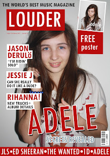
I put the mast head in the top left hand corner because this is part of a conventional magazine. This is placed here so that when the magazine is placed on the magazine rack, it is easy to see the name/masthead of the magazine. Also, the teaser is placed here in the left third so that when the magazine would be on the magazine rack, you would be able to see the information on the left easily. I have placed the date here because this is more conventional, when people read a magazine, this is where the date is usually placed and this is where they would usually look, for also the issue number, this is where it is placed on all well known magazines, this is why I placed the issue number and the date here. I have also placed the price here, this is very conventional, people will automatically look here for the price on magazines. I put the teasing contents under the main feature because this is where conventional magazines would put it. I used the colour scheme re dbecause I thoguht the colours white and red went together really well, I think it makes the magazine stand out more among others because red is a very dominent colour, therefore my magazine would dominent the other magazine well.

I added the conventional large headluine to state what the main article of the magazine is about. I looked at this double page spread and decided to put my main image of the left hand side mof the pages, I thought the miage been placed here looked best. The drop cap makes the whole artivle look better, this is very conventional so I added it to make it look like a more realistic magazine double page spread. I also added the pull quote to make it look more conventional as a double page spread. I decided not to add an introductory paragraph to my article because I thought if i added this it would make the right hand page look too crampt and not make it look professional. I decided to make most of the double page spread also red and white to keep the consistancy of the colour scheme.


I decided to add the features and news section because in all of the magazines I looked at, its very conventional to split the contents up into different sections such as news and features. I added the page numbers so that the audience will knows which page the information is on what they are looking for. I added a couple of imgaes to the contents page, this is very conventional and adds to how the contents page looks to the audience and comes across to the reader. The colour scheme also was very consistant throughout the contents page, I did this by making text and backgrounds red and white, to link back to the double page spread and the front cover.

IPC Media is a big publishing company so they would be able to distribute my magazine well throughout the target audience I have aimed it at, by putting it out so all different magazine shops etc. to make the sales go up. Because IPC media produce over 60 iconic media brands, and they have huge hits on the website they would be able to distribute my magazine well. They one produce one other music magazine which is the NME. This magazine has an audience with an average age of 25 whereas my magazine is aimed at 16-25. Although the age is very similar, the genre of both the NME and my magazine are completely different. NME is indie rock, whereas LOUDER is R&B/Pop. This means that LOUDER, if produced by IPC Media, will not have an impact on the sales of the NME music magazine.
My magazine was originally had an age range of 16-25 year olds, now I think that the rage is still the same, but now I think that not I have finished the magazine, although both males and females listen to this genre of music, but from the beginning, my demographic has changed, the age ranged has stayed the same but the gender has changed, I made it more to be aimed towards females by only putting females artist pictures. It was easy for me to do target this audience because I am interested in this genre, and I am the same age so it was easy for me to relate to the target audience. My magazine has huge artists on the front such as Jason Derulo and Rihanna, the audience are enticed to read more about the artists that they like and are big right now. I have changed the demographic because I found it easier to make the audience more concentrated on females because I am a female.
Specifically, my magazine appeals to the audience through the images throughout the magazine as they are all females in all of the images. The artists on the front cover are a mixture of male and female artists but this is what my target audience is interested in. My target audience is 16-25 year olds, my magazine portrays this by showing and including the things in which I think 16-25 year olds would be interested in, as they care about how they look, stereotypically the latest trends, and the “in music”. I have shown this by including artists that are in the current chart, and by using the model on the front of the cover, she is not wearing any make up or overly dressed, this would be the typical “girl next door” look. Stereotypically, girls of this age want to be seen as been “natural” and have the typical girly look such as long hair, clear face, perfect body and big eyes. Because this image is portrayed as the “correct” image within the media, by looking like this, it makes the audience think that they will be the “in crowd” if they portray this look.
When I asked for feedback on my magazine, one of the questions was “What price would you pay for this magazine?” I surveyed 10 people and the majority of the people I asked said they would buy my magazine for £1.99, this is the actual price that I decided to sell my magazine for. This means that I have chosen the correct price for my magazine and the intended target audience.
Whilst doing my magazine, I have learnt a lot about Photoshop. Before this project, I had never used Photoshop other than the preliminary task; I can now use all of the tools effectively.
I learnt how to use the spot healing brush. This tool allows you to remove spots on images that you do not want on there. You select the spot healing brush and then hover over the spot that you want to remove, and then click on top of the spot to remove it.
I also learnt how to use the patch tool. This allows you replace part of an image with a copied piece. You would click on the tool and then select the area of the image that you want to replicate, and then you would click and drag part of the image to the place that you want to be the same.
I learnt how to use the clone stamp tool. This is where you would select the area that you want to clone and then copy the part of the image you want in the correct area you want.
I also used the smudge tool. This is where you would want to smudge part of an image, you would do this by clicking on the tool and then a hand tool would appear, you would then point the hand in the par that you want smudging, you then press and hold the mouse button to smudge it.
I also used the polygon lasso tool. This is where you make a shape with the tool and then when clicked on that layer, you would only be able to work in that area that you selected and made the shape in.
I also learnt about how to change the image. By selecting the levels on Photoshop, I could make the image darker or lighter depending on the levels already on the image. When making the image lighter or darker, it will make the image more prominent on the page, this will make it overpower the text, even though the text is at the front of the image, it will make the image the main feature on the front cover.
I have learnt to format and adjust photos using Photoshop, these skills I believe will be transferrable in future which will benefit me in the long run. I have learnt a lot about Photoshop its self, such as the layers. Using the different layers helps to edit the text and pictures properly. You can lock layers so they cannot be edited until unlocked, which makes it helpful in case you would do something by an accident and could not undo it. Also, you can link a number of layers together; this can help by keeping different parts of text together, and/or linking text with their coloured backgrounds.


This is college magazine from my preliminary task. I have learnt a lot between the preliminary task and the main task. I now know how to use Photoshop properly such as the different tools and how to make use of the layers well. I know how to make the text stand out more by adding a coloured background, even though you may not be able to see the text on the image background, putting a background on the text will make it more clear and easy to read. I have learnt how to edit the picture well by adjusting the levels on the image and making the image richer. I also learnt that the image quality is very important. If the image was taking on a lower megapixel camera, it would make it hard for me to edit the picture effectively. Taking a picture on a good camera will make the image look clearer, also when editing it; it will make the editing look more clear and not make the image blurry. I now know how to use a lot more of the tools such as stroke and drop shadow to put on the text to make the text look more professional and conventional for the magazine. Because I did not know a lot about Photoshop in the preliminary task, this made it harder for me to make my magazine look good, now that I have had a lot more practice at Photoshop, I was able to make my music magazine look a lot better than my college magazine.
This is my final magazine;


Photoshop

 
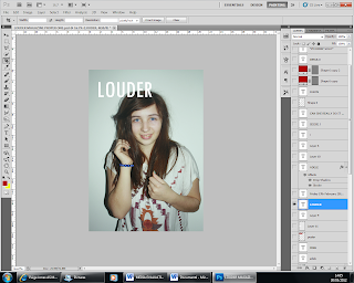
I opened the image in photoshop to start editing it for my magazine. I edited the image by changing the levels by making the image darker to make it more dominent on the page.


Here I selected the text tool and tpyed in the name of my magazine 'LOUDER'. I highlighted it and chenged the colour of the writing to white to make sure I followed the colour scheem that I wanted.


 Here, I used the Poloygon Lasso tool to make the square to go around the masthead text. I selected the paint brush tool and i colour it in red, to also follow the colour scheme.


 Here, I slected the text tool and typed in the text 'ADELE', I then rotated is to go across the page like a conventional magazine would, I then added a drop shadow and a sroke to make the text look better, and stand out as though it was 3d.


This is the box that came up when i selected the drop shadow, I changed the options to make it how I wanted it to look.


Here, I added the text 'SECRETS REVEALED' under the 'ADELE' text, this would make the audience mroe interested. I did this by selecting the text tool and typing in the text, I then added a stroke to give the text a white outline to make it look better and follow the colour scheme.
 Here, I added the text at the top of the front cover. I did this by selecting the etxt tool and typing in teh text 'THE WORLD BEST MUSIC MAGAZINE', this would make the magazine sell better.

Here, I added the red band at the bottom of the page, I did this by selecting the shape tool and drawing a rectangle, I then re-sized it and placed it to the bottom of the page.
 Here, I created the shapes that I would put the text in for the left third. I did this by selecting the Poloygon Lasso tool and drawing the shape, I then selecting the paint brush tool and coloured the shape in, with white to follow my colour scheme. I also made the rectangle in the same way in the top right hand corner.

 Here, I inserted the text the the left third. I did this by selecting the text tool and typing in the text that i wanted. I highlighted the text to changed the colour of the text to follow the colour scheme.

 Here, I inserted the smaller text to go with the stories on the side, I did this by selecting the text tool an dtyping in the text I wanted. I highlighted it and changed the colour of the text to follow my colour scheme.

 Here, I put the text in the red band at the bottom of the front cover, I did this by selecting the text tool and typing in the text that I wanted, i highlighted the text and recoloured the text to make sure it followed the colour scheme that I wanted.
 Here, I inserted another picture to the top right hand of the front cover. I did this by opening it in another photoshop programme and then slected the full images and then copied and pasted it onto the front cover. I also edited the image by adding a stroke to make a white border around the edge of the image, to make it better and follow the colour scheme.
 This is the box that came up when I selected the stroke option, I changed the options and settings to make the image look good.
Here, I added the text 'FREE' to the right hand corner for the poster. I did this by selecting the text tool and then typing in the text that I wanted.

Wednesday, 21 March 2012

Front Cover, Contents and Double Page Spread

I am going going to change my front cover, but the contents page, I am going to add more images and rearrange the text to make it look like more of a conventional magazine. I am also going to change my double page spread, I am going to make the article text on the page into columns to make it more conventional, I will also make the background picture more to the left to make sure the image is not cut off in the fold of the page, I will also move the text to also make sure it is not lost in the fold of the double page.